Xiaomi Poco M4 Pro vs. Nothing Phone (2a) Plus: A User-Centered Comparison
Let's dive into a comparative analysis of the Xiaomi Poco M4 Pro and the Nothing Phone (2a) Plus, focusing on the user experience rather than just raw specifications. We'll weave a narrative around their capabilities, highlighting how design choices translate into real-world use.
1. Design and Usability Assessment
| Feature | Xiaomi Poco M4 Pro | Nothing Phone (2a) Plus | User Experience Impact |
|---|---|---|---|
| Interface Design | MIUI 13 (Android 11) | Nothing OS 2.0 (Android 14) | Nothing OS, with its clean aesthetic and focus on customizability, offers a potentially more refreshing and less cluttered user experience. |
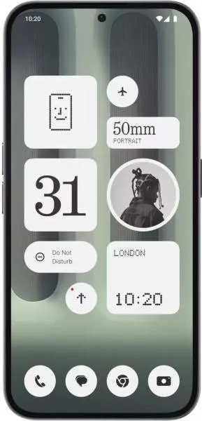
| Interaction Flow | Standard Android navigation with MIUI customizations | Glyph Interface, unique notification system. | The Glyph Interface adds a unique visual element to interactions, though its practical value depends on individual user preferences. |
| Accessibility Features | Standard Android accessibility features | Standard Android accessibility features + potential Glyph integration | Glyph Interface could potentially be adapted for unique accessibility features, but this remains to be fully explored. |
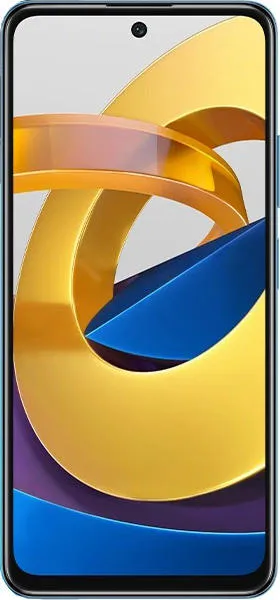
| Design Ergonomics | Plastic body, 179.5g | Aluminum frame, Gorilla Glass, 190g | The Nothing Phone feels more premium due to its materials. Slightly heavier, but the difference might be negligible for most users. |
2. Narrative-Driven Feature Exploration
Scenario: Imagine a student using their phone for note-taking, social media, and casual gaming.
Poco M4 Pro: The 90Hz AMOLED display provides a smooth experience for scrolling through notes and social media. The Helio G96 chipset handles everyday tasks well, though demanding games might push its limits. The large 5000mAh battery ensures all-day usage.
Nothing Phone (2a) Plus: The 120Hz AMOLED display and more powerful Dimensity 7350 Pro chipset deliver a noticeably smoother and more responsive experience, especially for gaming. The unique Glyph Interface could be customized to signify notifications from specific study groups or friends. Android 14 offers a more up-to-date software experience.
3. Inclusive Technology Evaluation
- Tech-Savvy User: Might appreciate the Nothing Phone's unique design, customizability, and powerful performance.
- Casual User: Might find the Poco M4 Pro's simpler interface and lower price point more appealing.
- User with Visual Impairments: Both phones rely on standard Android accessibility features. The potential of the Glyph Interface for accessibility remains untapped.
4. Design-Centric Decision Framework
The choice boils down to prioritizing distinct design and cutting-edge features versus simplicity and affordability. The Nothing Phone is a statement piece with its unique design language and offers a more powerful, future-proof platform with its newer OS. The Poco M4 Pro represents a more practical, budget-conscious option without sacrificing core functionality.
My Choice: Nothing Phone (2a) Plus
While the Poco M4 Pro is a solid device, I would choose the Nothing Phone (2a) Plus. Its unique design philosophy, embodied by the Glyph Interface, speaks to my appreciation for innovation and user-centric approaches. The smoother display, more powerful processor, and newer Android version promise a significantly better user experience in the long run. Although it's a bit pricier, the investment is justified for the enhanced performance, distinctive design, and the potential for future software updates. The aluminum frame and Gorilla Glass also contribute to a more premium and durable feel, aligning with a desire for a device that's both aesthetically pleasing and built to last. The longer software support promised by Nothing is also a significant factor in its favor.
