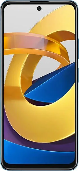
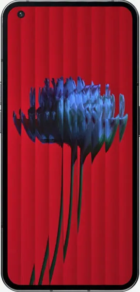
Xiaomi Poco M4 Pro vs. Nothing Phone (1): A User-Centered Comparison
Let's dive beyond the spec sheet and explore the Xiaomi Poco M4 Pro and the Nothing Phone (1) as complete user experiences, focusing on how their design choices translate into real-world usability for diverse individuals.
1. Design and Usability Assessment:
| Feature | Xiaomi Poco M4 Pro | Nothing Phone (1) | User Experience Impact | Category |
|---|---|---|---|---|
| Display | 6.43" AMOLED, 90Hz | 6.55" OLED, 120Hz, HDR10+ | The Nothing Phone (1)'s smoother refresh rate and HDR10+ support deliver a more visually immersive and responsive experience, especially for media consumption and gaming. | Interface Design |
| Build | Plastic back, side-mounted fingerprint sensor | Aluminum frame, glass back, in-display fingerprint sensor | The Nothing Phone (1)'s premium materials and more modern fingerprint sensor placement convey a higher quality feel and a sleeker aesthetic. | Design Ergonomics |
| OS & Updates | Android 11 (limited updates likely) | Android 12 (updates to Android 15 confirmed) | The Nothing Phone (1)'s longer software support ensures a more secure and feature-rich experience over time, fostering user trust and reducing e-waste. | Interaction Flow |
| Unique Feature | Glyph Interface - LED notification system | The Glyph Interface adds a unique visual element to notifications and interactions, potentially appealing to users who value distinctive design and personalized communication. | Interface Design |
2. Narrative-Driven Feature Exploration:
Scenario: Imagine a student using their phone for note-taking, research, and entertainment.
Poco M4 Pro: The 90Hz AMOLED display provides a smooth experience for scrolling through articles and taking notes. The large 5000mAh battery ensures long study sessions without needing a recharge. However, the limited software updates might mean missing out on new features and security patches in the long run.
Nothing Phone (1): The 120Hz OLED display with HDR10+ brings lecture videos and online content to life with vibrant colors and smooth motion. The Glyph Interface allows for customized notification patterns, silently alerting the student to important messages without disrupting class. The assured software updates provide peace of mind knowing the device will remain secure and up-to-date throughout their studies.
3. Inclusive Technology Evaluation:
- For a budget-conscious user: The Poco M4 Pro offers excellent value with its large battery and smooth display.
- For a user prioritizing long-term value and software experience: The Nothing Phone (1) is a better investment with its longer software support and premium features.
- For a user who values unique design and visual expression: The Glyph Interface of the Nothing Phone (1) offers a distinct aesthetic and personalized communication style.
4. Design-Centric Decision Framework:
Choosing between these devices depends on individual priorities:
- Prioritize Value: Poco M4 Pro
- Prioritize Long-Term Experience and Design: Nothing Phone (1)
My Choice: The Nothing Phone (1)
While the Poco M4 Pro offers impressive specifications for its price, the Nothing Phone (1) resonates more with my design-centric philosophy. Its commitment to long-term software updates, the premium build quality, the visually stunning OLED display, and the unique Glyph Interface demonstrate a focus on crafting a holistic and engaging user experience. The Nothing Phone (1) isn't just a device; it's a statement about thoughtful design and user-focused innovation. It represents a conscious effort to create technology that is both functional and aesthetically pleasing, appealing to users who value both performance and style.

