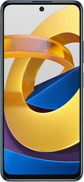
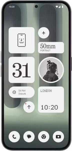
Let's dive into a user-centered comparison of the Xiaomi Poco M4 Pro 5G and the Nothing Phone (2a) Plus. Instead of a dry recitation of specs, we'll craft a narrative that highlights how these devices feel in your hand and how their design choices impact your daily interactions.
1. Design and Usability Assessment:
| Feature | Poco M4 Pro 5G | Nothing Phone (2a) Plus | User Experience Impact |
|---|---|---|---|
| Interface Design | MIUI 12.5 (Android 11) | Nothing OS 2.0 (Android 14) | Nothing OS offers a cleaner, more stock Android-like experience with unique Glyph lighting. MIUI can feel more cluttered. |
| Interaction Flow | 90Hz IPS LCD | 120Hz AMOLED | The Nothing Phone's smoother AMOLED display provides a more fluid and visually engaging experience. Scrolling and animations will feel significantly more premium. |
| Accessibility Features | Standard Android Accessibility Suite | Standard Android Accessibility Suite + potential Glyph customizations | Both offer basic accessibility, but Nothing's Glyph interface has the potential for unique accessibility features like visual notifications for the hearing impaired, though it's underdeveloped at this point. |
| Design Ergonomics | Plastic back, side-mounted fingerprint | Aluminum frame, glass back, under-display fingerprint | The Nothing Phone feels more premium and modern due to its material choices. Fingerprint sensor placement is a matter of preference. |
2. Narrative-Driven Feature Exploration:
Scenario: A Day in the Life:
Imagine you're a freelance photographer. With the Poco M4 Pro, you're capturing a vibrant street scene. The 90Hz screen does a decent job keeping up with your fast-paced scrolling through photos, but under the bright sun, the LCD struggles with visibility. Later, while editing, the colors seem a little washed out.
Now, imagine the same scenario with the Nothing Phone (2a) Plus. The 120Hz AMOLED display is a game-changer. The smooth refresh rate keeps up with your every swipe and pinch, while the vibrant colors and deep blacks of the AMOLED screen bring your photos to life, even in direct sunlight. The unique Glyph lighting system could even be programmed to signal incoming client calls without disturbing your workflow visually.
3. Inclusive Technology Evaluation:
For a user who prioritizes affordability and basic functionality, the Poco M4 Pro is a solid choice. However, for someone who values a more refined visual experience, premium design, and the potential for unique software features, the Nothing Phone (2a) Plus caters to a more discerning user. The visually distinctive Glyph system on the Nothing Phone may also appeal to users who desire a more personalized and expressive device.
4. Design-Centric Decision Framework:
The Poco M4 Pro is a practical device, focusing on functionality over flair. The Nothing Phone (2a) Plus prioritizes design and user experience, aiming for a more premium and engaging interaction.
My Choice: Nothing Phone (2a) Plus
While the Poco M4 Pro is a commendable budget option, the Nothing Phone (2a) Plus resonates more strongly with my user-centric approach. The superior AMOLED display, the smoother refresh rate, the more premium design materials, and the innovative Glyph interface contribute to a significantly more engaging and enjoyable user experience. The Nothing Phone feels like a device designed with intention, aiming to create a more personal and interactive connection with its user. While the Glyph system may seem gimmicky to some, its potential for customization and unique functionality hints at a more expressive and inclusive future for mobile interactions. The two-year newer OS is also a big plus, meaning it will receive updates and security patches for longer.

