Let's dive into a user-centered comparison of the vivo iQOO 12 and the Nothing Phone (2a). Both phones offer compelling features in the mid-range market, but their design philosophies and user experience implications differ significantly.
1. Design and Usability Assessment:
| Feature | vivo iQOO 12 | Nothing Phone (2a) | User Experience Impact |
|---|---|---|---|
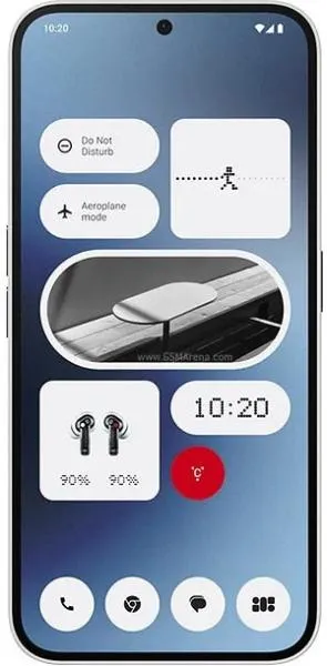
| Interface Design | Classic, performance-focused | Minimalist, glyph interface | iQOO 12 offers a familiar Android experience. Nothing Phone (2a) provides a unique visual identity with its glyph system. |
| Interaction Flow | Standard Android navigation | Glyph-based notifications & interactions | Nothing Phone (2a)'s glyphs offer a novel way to interact, potentially streamlining certain tasks. |
| Accessibility | Standard Android accessibility features | Potential for glyph-based accessibility | Both offer standard features, but Nothing's glyphs could be innovative for visual or auditory notifications. |
| Ergonomics | Slightly heavier, slimmer profile | Lighter, slightly thicker | Preference depends on user priorities; slimness vs. lighter weight. |
2. Narrative-Driven Feature Exploration:
Scenario: A Day in the Life: Imagine a busy professional using each phone. The iQOO 12 user seamlessly navigates through tasks with its powerful Snapdragon 8 Gen 3 processor, enjoying smooth multitasking and vibrant visuals on the high-resolution, bright display. They appreciate the familiar Android experience and the phone's responsive performance.
The Nothing Phone (2a) user, on the other hand, enjoys a unique experience. The glyphs pulse with incoming calls and notifications, offering a customizable and visually engaging way to stay informed without constantly checking the screen. They appreciate the phone's distinctive design and the subtle yet impactful way the glyphs integrate into daily use.
3. Inclusive Technology Evaluation:
User Group Considerations:
- Power Users: The iQOO 12's superior processing power and higher refresh rate display will appeal to gamers and those who demand top-tier performance.
- Design-Conscious Users: The Nothing Phone (2a)'s unique aesthetic and glyph interface will attract those seeking a distinctive and visually engaging device.
- Accessibility Needs: While both phones offer standard accessibility features, the potential for innovative glyph-based accessibility features on the Nothing Phone (2a) could benefit users with specific needs.
4. Design-Centric Decision Framework:
Beyond the Specs: Choosing between these phones hinges on more than just raw specifications. It's about aligning the device's design philosophy with your personal preferences and usage patterns. Do you prioritize raw power and a familiar Android experience? Or are you drawn to innovative design and unique interaction paradigms?
My Choice:
I would choose the Nothing Phone (2a). While the iQOO 12 boasts impressive specifications, the Nothing Phone (2a) resonates with my appreciation for innovative design and user-centered thinking. The glyph interface, while potentially polarizing, offers a fresh perspective on how we interact with our devices. Its unique aesthetic and potential for accessibility enhancements represent a bold step towards a more human-centered approach to technology. I value the attempt to create a distinctive user experience that goes beyond simply increasing processing power or screen resolution. The commitment to a different kind of interaction, even if it's not perfect yet, is exciting and aligns with my design philosophy.
