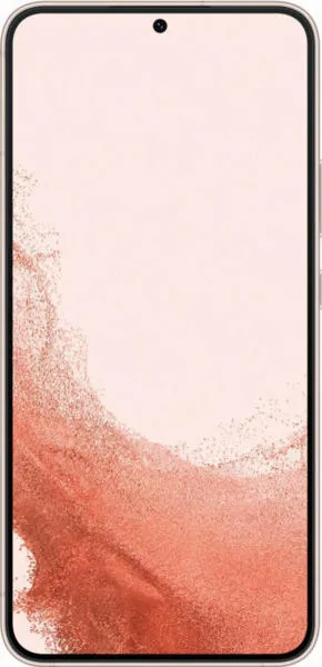
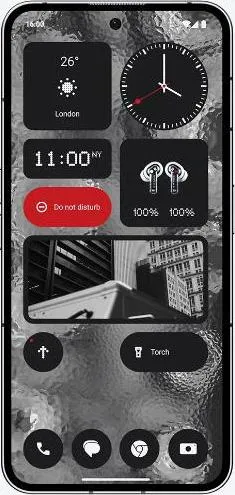
Samsung Galaxy S22+ 5G vs. Nothing Phone (2): A User-Centered Perspective
Let's move beyond the raw numbers and explore the user experience landscape of the Samsung Galaxy S22+ 5G and the Nothing Phone (2). As a technology communications specialist, my aim is to paint a vivid picture of how these devices translate technical capabilities into tangible user interactions.
1. Design and Usability Assessment:
| Feature Category | Samsung Galaxy S22+ 5G | Nothing Phone (2) | User Experience Impact |
|---|---|---|---|
| Interface Design | Refined, mature One UI | Unique Glyph Interface | S22+ offers familiarity; Nothing Phone (2) offers novelty and potential for distinctive interactions. |
| Interaction Flow | Smooth, established navigation patterns | Potentially innovative with Glyph integration | S22+ provides a predictable experience; Nothing Phone (2)'s success depends on seamless Glyph implementation. |
| Accessibility Features | Extensive suite of accessibility options | Information pending further investigation | S22+ demonstrably caters to a wider range of user needs. |
| Design Ergonomics | Sleek, compact design | Larger, slightly heavier | S22+ might be more comfortable for one-handed use; Nothing Phone (2)'s larger display could enhance media consumption. |
2. Narrative-Driven Feature Exploration:
Imagine a busy professional juggling emails and presentations. The S22+'s bright 1750 nit display ensures clear visibility even in direct sunlight, allowing seamless workflow transitions between indoor and outdoor environments. Meanwhile, a creative individual might be drawn to the Nothing Phone (2)'s Glyph Interface, using its customizable light patterns for unique notifications and personalized expression. The Glyph Interface, while novel, needs to prove its practical value beyond aesthetic appeal.
3. Inclusive Technology Evaluation:
For a user prioritizing accessibility, the S22+'s comprehensive suite of features provides a clear advantage. The Nothing Phone (2)'s accessibility offerings require further investigation to determine its inclusivity. Senior users, for instance, might find the S22+'s familiar interface more approachable, while tech-savvy individuals might be intrigued by the Nothing Phone (2)'s experimental features.
4. Design-Centric Decision Framework:
The choice between these devices hinges on individual priorities. The S22+ offers a polished, predictable experience with a focus on refined design and established usability. The Nothing Phone (2) presents a bolder proposition, inviting users to explore a new design language and potentially innovative interaction paradigms. However, the long-term usability and practicality of the Glyph Interface remain to be seen.
My Choice: Samsung Galaxy S22+ 5G
While the Nothing Phone (2) intrigues with its unique Glyph Interface, I value the refined user experience and proven reliability of the Samsung Galaxy S22+. Its brighter display, comprehensive accessibility features, and sleek design align more closely with my personal preferences and professional needs. For me, the S22+ represents a more mature and well-rounded user experience, whereas the Nothing Phone (2), while promising, needs to demonstrate the true value and seamless integration of its novel features in real-world usage. I prefer a device that excels in core functionality and usability over one that prioritizes novelty with potential usability trade-offs.

