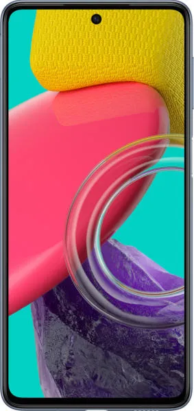
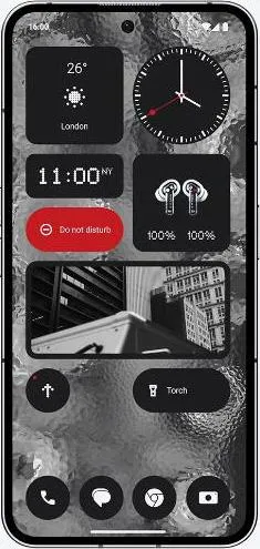
The Tale of Two Phones: Samsung Galaxy M53 vs. Nothing Phone (2)
As a technology communications specialist, my goal isn't just to list specs, but to weave a narrative that illuminates the user experience. Let's embark on a journey to understand the souls of these two devices.
Design and Usability Assessment
| Feature | Samsung Galaxy M53 | Nothing Phone (2) | User Experience Impact |
|---|---|---|---|
| Interface Design | Standard Android Skin | Custom Android Skin with Glyph Interface | Nothing Phone (2)'s unique Glyph interface offers a distinct visual identity and potential for innovative interactions, enhancing engagement. |
| Interaction Flow | Traditional Android navigation | Potentially enhanced by Glyph interface integration | Depending on implementation, the Glyph interface could streamline or complicate interactions. Requires hands-on evaluation for definitive analysis. |
| Accessibility | Standard Android accessibility features | Potential for Glyph interface to enhance visual/auditory feedback | The Glyph interface could offer unique accessibility benefits, but careful design is crucial to avoid exclusion. |
| Design Ergonomics | Lighter (176g), thinner (7.4mm) | Heavier (201.2g), thicker (8.6mm) | M53 prioritizes portability and comfort for extended use, while Phone (2) might feel more substantial in hand. |
Narrative-Driven Feature Exploration
Scenario: Imagine a sunny afternoon at the park. The M53's dimmer screen struggles against the glare, while the Phone (2)'s vibrant 1600 nit display shines, effortlessly showcasing photos and videos. This illustrates the crucial role of brightness in real-world usability.
Scenario: You're a mobile gamer. The Phone (2)'s powerful Snapdragon 8+ Gen 1 processor handles demanding games with ease, offering a fluid and responsive experience. The M53, with its Dimensity 900, provides a decent gaming experience, but might struggle with graphically intensive titles. This highlights how processing power translates into tangible user enjoyment.
Inclusive Technology Evaluation
User 1: A senior citizen might appreciate the M53's lighter weight and familiar Android interface.
User 2: A young professional might be drawn to the Phone (2)'s cutting-edge design, powerful performance, and faster charging.
User 3: A visually impaired user could potentially benefit from the Phone (2)'s Glyph interface for unique notification feedback, but its effectiveness depends on accessibility implementation.
Design-Centric Decision Framework
Beyond raw specs, the choice boils down to personal priorities:
- Prioritize portability and affordability? The M53 offers a lighter, more budget-friendly option.
- Crave cutting-edge design, performance, and unique features? The Phone (2) delivers a premium experience.
My Choice: The Nothing Phone (2)
While the M53 is a respectable contender, the Nothing Phone (2) resonates with my design-centric philosophy. Its unique Glyph interface, though needing thorough hands-on evaluation for usability, embodies a bold attempt at innovation. The significantly more powerful processor and brighter display promise a superior user experience in everyday tasks and demanding applications. The faster charging and wireless charging capabilities cater to a modern lifestyle. While heavier, the Phone (2)'s design language and potential for future software enhancements aligning with the Glyph interface tip the scales for me. It represents a step towards a more engaging and expressive mobile future, and I am eager to explore its potential fully.

