Samsung Galaxy A13 vs. Nothing Phone (2): A User-Centered Perspective
As a technology communications specialist, my goal is to help you understand these phones beyond the raw numbers. Let's delve into a narrative-driven comparison, focusing on how design choices translate into real-world user experiences.
1. Design and Usability Assessment:
| Feature Category | Samsung Galaxy A13 | Nothing Phone (2) | User Experience Impact |
|---|---|---|---|
| Interface Design | Standard Android 12 (upgradable to 13), familiar layout | Android 13 with Nothing OS 2 overlay, unique Glyph Interface | A13 offers a predictable experience; Nothing Phone (2) provides a visually distinct, potentially more engaging interface. |
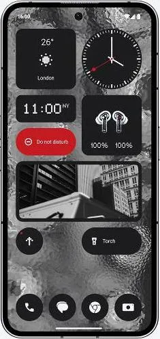
| Interaction Flow | Traditional touch-based navigation, PLS LCD screen with standard refresh rate | Touch-based navigation, LTPO OLED with 120Hz adaptive refresh rate, Glyph Interface for notifications and interactions | Nothing Phone (2)'s smoother display and innovative Glyph Interface offer a more fluid and potentially more intuitive interaction. |
| Accessibility Features | Standard Android accessibility features | Standard Android accessibility features + potential for Glyph customization for visual/auditory notifications | Both offer basic accessibility, but Nothing Phone (2) could offer more personalized accessibility through Glyphs, depending on software implementation. |
| Design Ergonomics | Plastic body, side-mounted fingerprint sensor | Aluminum frame, glass back, in-display fingerprint sensor | Nothing Phone (2) feels more premium and potentially more durable. The in-display fingerprint sensor is often perceived as more modern. |
2. Narrative-Driven Feature Exploration:
Scenario: Imagine you're at a bustling concert.
- A13: You pull out your phone to capture a video. The LCD screen struggles with visibility in bright sunlight. You miss a key moment fumbling to unlock the phone with the side-mounted sensor.
- Nothing Phone (2): The vibrant OLED screen on the Nothing Phone (2) offers clear visibility even in challenging lighting. The Glyph Interface subtly pulses with the rhythm of the music, providing a unique visual notification experience without needing to look at the screen. You effortlessly unlock it with the in-display fingerprint sensor and capture a crisp 4K video at 60fps, stabilized by OIS and EIS.
This scenario highlights how seemingly minor spec differences translate into significantly different user experiences. The Nothing Phone (2)'s superior display, faster processor, and unique features enhance immersion and capture memories more effectively.
3. Inclusive Technology Evaluation:
- For the technically hesitant: The A13 offers a familiar Android experience, minimizing the learning curve.
- For the creative explorer: The Nothing Phone (2) encourages experimentation with its unique Glyph Interface and advanced camera features.
- For the budget-conscious: The A13 provides essential smartphone functionality at a lower price point.
4. Design-Centric Decision Framework:
The choice between these phones boils down to your priorities: familiarity versus innovation, affordability versus premium features. The A13 offers a reliable, budget-friendly experience, while the Nothing Phone (2) presents a unique, design-forward approach to mobile technology.
My Choice: As Sophia Rodriguez, I would choose the Nothing Phone (2). While the Galaxy A13 offers a familiar experience, the Nothing Phone (2) embodies the principles of user-centered design that I champion. Its innovative Glyph Interface, superior display, and powerful processor combine to create a more engaging and intuitive user experience. The commitment to a unique design language, pushing the boundaries of traditional smartphone interaction, resonates with my appreciation for design that enhances usability and sparks joy. It's a device that not only performs well but also tells a story – a story of innovation and a commitment to a more human-centered approach to technology.
