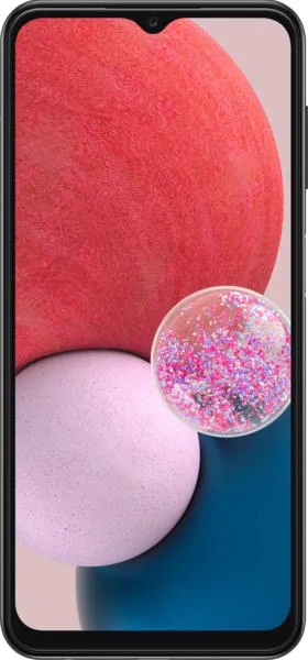
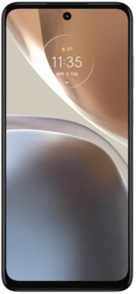
Samsung Galaxy A13 vs. Motorola Moto G32: A User-Centered Comparison
Let's dive beyond the spec sheet and explore the Samsung Galaxy A13 and Motorola Moto G32 as experiences, not just devices. My analysis prioritizes how design choices translate into real-world usability for you, the user.
1. Design and Usability Assessment:
| Feature | Samsung Galaxy A13 | Motorola Moto G32 | User Experience Impact |
|---|---|---|---|
| Interface Design | One UI Core 4.1 | My UX | One UI offers a feature-rich but potentially overwhelming experience. My UX emphasizes clean design and close-to-stock Android experience. |
| Interaction Flow | Standard Android Navigation | Standard Android Navigation | Both offer familiar navigation, but subtle animations and transitions can significantly impact the feeling of fluidity and responsiveness. |
| Accessibility Features | Basic Android Accessibility | Basic Android Accessibility | Both rely on standard Android accessibility features. Deeper customization options are crucial for users with specific needs. |
| Design Ergonomics | Larger, slightly heavier | Slimmer, lighter | The Moto G32 might offer a more comfortable one-handed experience due to its lighter weight and slimmer profile. |
2. Narrative-Driven Feature Exploration:
Scenario: Imagine you're a student rushing between classes, needing to quickly capture notes and access online resources.
- A13 Story: The A13's large 6.6" display provides ample space for note-taking apps, but its PLS LCD might lack the vibrant colors and contrast of an AMOLED screen, potentially straining your eyes during extended use.
- G32 Story: The G32's 6.5" IPS LCD with a 90Hz refresh rate offers smoother scrolling and a more responsive feel, making it easier to navigate between apps and websites. This fluid experience reduces frustration and enhances productivity. The slightly smaller screen might feel less immersive for media consumption.
3. Inclusive Technology Evaluation:
- For the budget-conscious user: Both phones offer excellent value. However, the fluctuating prices of the A13 require careful consideration of storage options. The G32's pricing seems more consistent across variants.
- For the power user: Neither phone excels in raw processing power, but the G32's Snapdragon 680 might offer a slight edge in performance over the A13's Exynos 850, especially for multitasking.
- For the visually impaired: Both offer standard Android accessibility features. However, a deeper dive into customization options (font sizes, color contrast adjustments) is needed to determine which phone caters better to individual visual needs.
4. Design-Centric Decision Framework:
The choice hinges on your priorities:
- Prioritize Display Fluidity and Comfortable Handling: Moto G32
- Prioritize Larger Screen Real Estate: Samsung Galaxy A13
My Choice: Motorola Moto G32
While the A13 boasts a larger screen, the Moto G32 wins for its 90Hz refresh rate, making everyday interactions feel noticeably smoother. This responsiveness enhances the overall user experience, contributing to a more enjoyable and efficient phone interaction. The slimmer profile and lighter weight further contribute to its superior ergonomics, making it a pleasure to hold and use. In my user-centered framework, the G32's design choices translate to a more satisfying and intuitive mobile experience.

