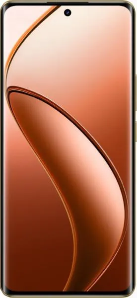
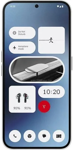
Realme 12 Pro+ vs. Nothing Phone (2a): A User-Centered Comparison
Let's dive beyond the spec sheet and explore these two mid-range contenders through a user-focused lens. Both the Realme 12 Pro+ and Nothing Phone (2a) offer compelling features, but their design philosophies and user experience implications differ significantly.
1. Design and Usability Assessment:
| Feature | Realme 12 Pro+ | Nothing Phone (2a) | User Experience Impact |
|---|---|---|---|
| Interface Design | Classic Android Skin | Glyph Interface, Custom Android Skin | Nothing Phone (2a)'s unique Glyph interface offers a distinct visual identity and potentially novel interaction methods. |
| Interaction Flow | Standard Android Navigation | Glyph-integrated notifications, custom sounds | The Glyph interface could streamline notification management for some, while others might find it distracting. |
| Accessibility | Standard Android Accessibility Features | Potential for Glyph-based accessibility cues | The Glyph interface presents an opportunity for innovative accessibility features, yet to be fully realized. |
| Design Ergonomics | Slightly lighter, narrower | Slightly thinner | Negligible differences in hand feel for most users. |
2. Narrative-Driven Feature Exploration:
Scenario: Imagine you're at a bustling concert.
- Realme 12 Pro+: You pull out your phone to capture a video. The 4K@30fps with EIS ensures a stable, high-quality recording. It's a familiar, reliable experience.
- Nothing Phone (2a): You receive a text. Instead of a jarring ringtone, a unique Glyph pattern lights up on the back, subtly alerting you without disrupting the atmosphere. You can even assign specific Glyphs to contacts, creating a personalized notification system.
This scenario highlights how the Nothing Phone (2a) attempts to redefine interaction through its design.
3. Inclusive Technology Evaluation:
- For the Tech-Savvy: The Nothing Phone (2a) offers a unique, customizable experience. Its distinctive design and Glyph interface appeal to those seeking something different.
- For the Pragmatic User: The Realme 12 Pro+ provides a familiar, reliable Android experience with a strong focus on core functionalities like camera performance.
- For the Accessibility-Focused User: While both phones offer standard Android accessibility features, the Nothing Phone (2a)'s Glyph interface holds potential for future accessibility innovations.
4. Design-Centric Decision Framework:
Choosing between these devices hinges on your personal priorities:
- Prioritize Uniqueness and Customization: Choose the Nothing Phone (2a).
- Prioritize Familiarity and Core Performance: Choose the Realme 12 Pro+.
My Choice: Nothing Phone (2a)
While the Realme 12 Pro+ offers a solid, familiar experience, I'm drawn to the Nothing Phone (2a)'s bold design philosophy. The Glyph interface, though potentially polarizing, represents a genuine attempt to innovate in a saturated market. Its potential for unique interaction and accessibility features, combined with a competitive spec sheet, makes it a more compelling choice for me. It aligns with my mission to highlight designs that push boundaries and explore new possibilities in user experience. I value the ambition to reimagine how we interact with our devices, even if it means embracing a learning curve. The Nothing Phone (2a) embodies this spirit of innovation, making it a more exciting prospect from a design and user experience perspective.

