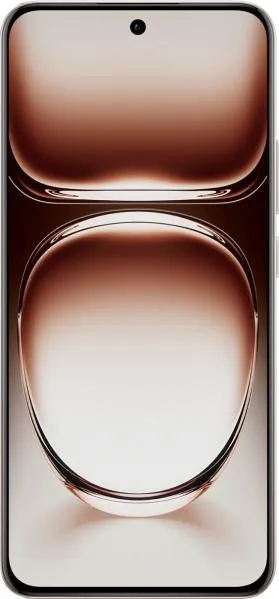
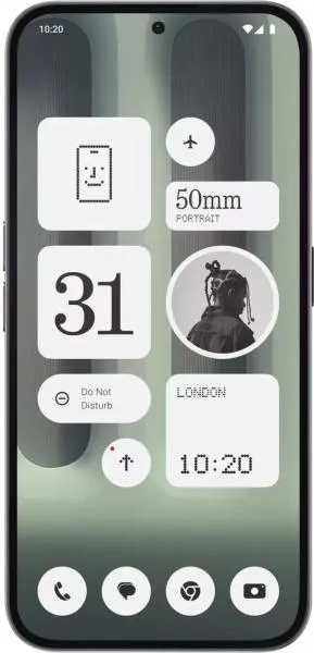
Oppo Reno12 vs. Nothing Phone (2a) Plus: A User-Centered Perspective
As a technology communications specialist, my goal is to help you understand these phones beyond the spec sheet. Let's delve into the Reno12 and Phone (2a) Plus, focusing on how their design and features translate into real-world user experiences.
1. Design and Usability Assessment:
| Feature | Oppo Reno12 | Nothing Phone (2a) Plus | User Experience Impact |
|---|---|---|---|
| Interface Design | Clean, likely ColorOS based on Android 14 | Likely a near-stock Android 14 with Nothing OS customizations (Glyph Interface) | Reno12 offers a potentially more feature-rich but potentially less intuitive interface. Nothing Phone focuses on minimalist aesthetics with unique Glyph notifications. |
| Interaction Flow | Smooth performance expected with 120Hz AMOLED display and Dimensity 7300 | Similar performance expected with 120Hz AMOLED display and Dimensity 7350 Pro; Glyph Interface adds a new layer of interaction. | Both phones should feel responsive. Nothing Phone's Glyph interface might be initially intriguing but could become distracting or gimmicky depending on user preference. |
| Accessibility Features | Standard Android 14 accessibility features expected (e.g., text scaling, voice control) | Standard Android 14 features plus potential Glyph customizations for accessibility notifications | Both leverage Android’s accessibility framework. The Nothing Phone could offer unique accessibility advantages with creative Glyph integration. |
| Design Ergonomics | Lighter (177g) and slimmer (7.6mm) | Heavier (190g) and thicker (8.5mm) | Reno12 provides a more comfortable in-hand feel for extended use, particularly for users with smaller hands. |
2. Narrative-Driven Feature Exploration:
Scenario: Imagine you're at a bustling concert.
- Reno12: You effortlessly capture high-quality 4K video with impressive stabilization (OIS & EIS) at 30fps, preserving the energy of the performance. The slim profile allows for comfortable one-handed recording, even in a crowded environment.
- Phone (2a) Plus: You rely on the unique Glyph Interface for customized silent notifications, allowing you to stay aware of important messages without disturbing those around you. However, the heavier weight might become noticeable after prolonged recording.
3. Inclusive Technology Evaluation:
- For the Casual User: The Reno12's lighter weight and potentially more familiar ColorOS interface might be more appealing.
- For the Tech Enthusiast: The Phone (2a) Plus offers a distinct experience with the Glyph interface and the potential for greater customization.
- For Users with Accessibility Needs: Both devices provide a foundation through Android 14. However, exploration into how Nothing Phone's Glyph system can be personalized for visual or auditory impairments could be groundbreaking.
4. Design-Centric Decision Framework:
Choosing between these devices hinges on your personal priorities:
- Prioritize Comfort and Familiarity: Oppo Reno12
- Prioritize Unique Features and Potential for Customization: Nothing Phone (2a) Plus
Beyond the Specs: This comparison underscores the importance of user experience. While both phones boast similar raw specifications, their design philosophies create vastly different interactions. The Reno12 leans toward a refined, conventional experience, while the Nothing Phone (2a) Plus embraces a bolder, more experimental approach. Ultimately, the "best" phone depends on your individual needs and preferences.

