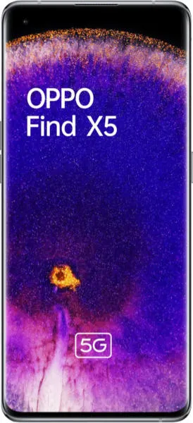
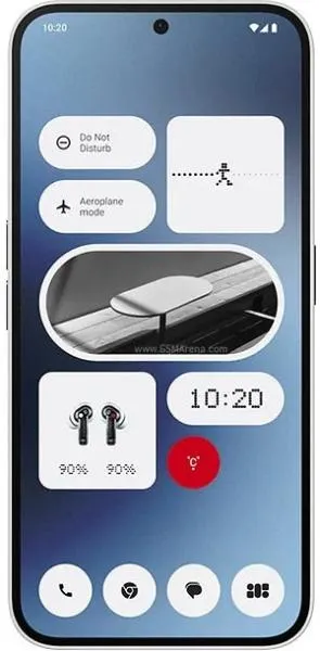
Oppo Find X5 vs. Nothing Phone (2a): A User-Centered Comparison
Let's embark on a journey beyond the spec sheet, exploring the Oppo Find X5 and Nothing Phone (2a) as holistic user experiences. My analysis, as a technology communications specialist, prioritizes how design choices translate into real-world usability for diverse individuals.
1. Design and Usability Assessment
| Feature | Oppo Find X5 | Nothing Phone (2a) | User Experience Impact |
|---|---|---|---|
| Interface Design | Refined, subtle animations, curved display | Minimalist, Glyph Interface, flat display | Find X5 offers a premium aesthetic; Nothing Phone (2a) is distinctive and potentially more functional with its Glyph. |
| Interaction Flow | Smooth, responsive due to Snapdragon 888 | Smooth, but Dimensity 7200 Pro might show slight performance differences in demanding tasks | Find X5 likely offers a slightly more fluid experience. |
| Accessibility Features | Standard Android accessibility options | Standard Android accessibility options, potential for Glyph customization for notifications | Nothing Phone (2a)'s Glyph interface could offer unique accessibility customization for visual or hearing impairments. |
| Design Ergonomics | Curved display can feel slippery, slightly heavier | Flat display, easier grip, lighter | Nothing Phone (2a) might be more comfortable for extended use. |
2. Narrative-Driven Feature Exploration
Scenario: Imagine a busy professional juggling emails, video calls, and social media. The Find X5's superior processing power ensures seamless multitasking, transitioning effortlessly between apps. Its vibrant AMOLED display, with a billion colors, transforms watching a quick video into a visual feast. However, that same professional might appreciate the Nothing Phone (2a)'s unique Glyph Interface during meetings, allowing for silent, customizable light notifications without disrupting the flow. The flat display and lighter weight could also be preferable for extended use during travel.
Scenario: A photography enthusiast explores a bustling city. The Find X5's Sony IMX766 sensors and MariSilicon X imaging NPU capture stunning detail and vibrant colors, even in challenging light. The dedicated telephoto lens offers versatility. However, the Nothing Phone (2a) focuses on a more streamlined camera experience with its dual rear camera setup, emphasizing ease of use over specialized features.
3. Inclusive Technology Evaluation
User 1: A Senior Citizen: Might prefer the Nothing Phone (2a)'s larger, flatter display for easier readability and reduced glare. The Glyph Interface, if customized for important calls, could be a visual aid.
User 2: A Young Professional: Might appreciate the Find X5's premium design, powerful performance, and advanced camera features for content creation.
User 3: A User with Visual Impairments: Could potentially benefit from the Nothing Phone (2a)'s Glyph Interface for customized visual notifications, supplementing auditory cues.
4. Design-Centric Decision Framework
The choice boils down to individual priorities:
- Prioritize Premium Aesthetics and Performance: Choose the Oppo Find X5.
- Prioritize Distinctive Design, Lighter Weight, and Potential for Unique Accessibility: Choose the Nothing Phone (2a).
My Choice: The Nothing Phone (2a)
While the Oppo Find X5 offers a compelling package of premium features, I am drawn to the Nothing Phone (2a)'s innovative design philosophy. The Glyph Interface, while potentially gimmicky to some, represents a bold step towards reimagining how we interact with our devices. Its potential for accessibility customization is genuinely exciting. Further, the flatter display, lighter weight, and longer software update commitment align with my preference for a comfortable, long-term user experience. The slightly lower processing power is a trade-off I am willing to make for the unique blend of design and functionality offered by the Nothing Phone (2a). It embodies a spirit of playful innovation that resonates with my vision of user-centered technology.

