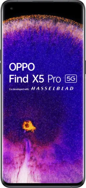
Oppo Find X5 Pro vs. Nothing Phone (2): A User-Centered Perspective
As a technology communications specialist, my goal is to move beyond raw specifications and delve into how these devices translate into real-world user experiences. Let's explore the Oppo Find X5 Pro and the Nothing Phone (2) through a narrative lens, focusing on design, usability, and inclusive technology principles.
1. Design and Usability Assessment
| Feature | Oppo Find X5 Pro | Nothing Phone (2) | User Experience Impact |
|---|---|---|---|
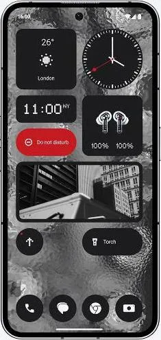
| Interface Design | Refined, minimalist with subtle animations | Unique Glyph Interface, playful, customizable LEDs | Nothing Phone (2)'s Glyph interface offers a distinctive visual experience and functional customization, potentially appealing to users seeking unique interaction paradigms. |
| Interaction Flow | Smooth, fluid, thanks to the 120Hz LTPO2 AMOLED display | Smooth, 120Hz LTPO OLED display, responsive | Both offer excellent responsiveness. However, the slightly more advanced LTPO2 technology in the Find X5 Pro might provide subtle power efficiency benefits. |
| Accessibility Features | Standard Android accessibility features | Standard Android accessibility features | Both rely on Android's built-in accessibility features, offering comparable options for users with diverse needs. |
| Design Ergonomics | Premium ceramic back, curved edges, can be slippery | Lighter, flatter sides, improved grip | The Nothing Phone (2)'s lighter weight and flatter edges might provide a more comfortable and secure in-hand feel for extended use. |
2. Narrative-Driven Feature Exploration
Scenario: Imagine a photographer capturing a vibrant street scene. The Find X5 Pro, with its superior camera hardware (Sony IMX766 sensors, MariSilicon X chip), allows for capturing stunning detail and dynamic range, even in challenging light. The photographer can seamlessly switch between lenses, leveraging the dedicated telephoto for crisp zoomed shots. However, the Nothing Phone (2) doesn't concede defeat offering a refined camera experience centered around the versatility of its dual 50MP sensors and user-friendly features.
Scenario: A user navigating a bustling city relies on their phone for directions and quick communication. Both phones offer vibrant displays with excellent readability outdoors. However, the Nothing Phone (2)'s Glyph Interface can subtly notify the user of incoming messages or calls without disrupting their flow, a unique advantage in busy environments.
3. Inclusive Technology Evaluation
Both devices cater to a broad audience. The Find X5 Pro's focus on a refined, premium experience may appeal to users who prioritize performance and aesthetics. The Nothing Phone (2), with its unique Glyph Interface and lighter build, might resonate with users seeking a more playful and distinctive technological expression.
4. Design-Centric Decision Framework
The choice between these devices hinges on individual priorities. If premium camera capabilities and a refined aesthetic are paramount, the Find X5 Pro excels. If a distinctive design, innovative interface, and a lighter, more comfortable feel are desired, the Nothing Phone (2) stands out.
My Choice: The Nothing Phone (2)
While the Oppo Find X5 Pro boasts impressive specifications, I would choose the Nothing Phone (2). Its unique Glyph Interface genuinely excites me. It represents a thoughtful attempt to reimagine how we interact with our devices, moving beyond the conventional screen-centric paradigm. The lighter weight and flatter edges also contribute to a more comfortable user experience. Ultimately, the Nothing Phone (2) embodies a more playful and innovative approach to mobile technology, aligning with my appreciation for human-centered design and distinctive user experiences. It's a device that sparks conversation and invites exploration, perfectly embodying the spirit of making technology more engaging and accessible for everyone.
