Let's dive into a user-centered comparison of the Oppo A96 and the Nothing Phone (1), moving beyond mere specs to uncover the stories these devices tell about the user experience.
1. Design and Usability Assessment
| Feature | Oppo A96 | Nothing Phone (1) | User Experience Impact |
|---|---|---|---|
| Interface Design | Standard Android Skin | Custom Android Skin with Glyph Interface | Nothing Phone's unique Glyph interface offers a distinctive visual identity and potential for innovative interaction paradigms. |
| Interaction Flow | Traditional Android Navigation | Gesture-based navigation, Glyph Notifications | Nothing Phone emphasizes a more modern, streamlined interaction, potentially reducing friction for experienced users. |
| Accessibility | Standard Android Accessibility Features | Potential for Glyph-based accessibility cues | The Glyph interface could offer unique accessibility features, but this requires thoughtful implementation and user testing. |
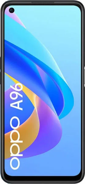
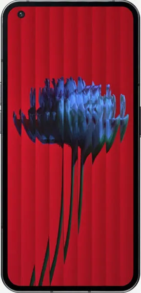
| Design Ergonomics | Standard slab design, lightweight | Distinctive transparent back, slightly heavier | Nothing Phone prioritizes visual differentiation, while Oppo focuses on familiar comfort. |
2. Narrative-Driven Feature Exploration
Scenario: Imagine a busy professional constantly juggling calls, notifications, and tasks.
- Oppo A96: The A96 offers a familiar Android experience. Our professional can efficiently navigate through apps, manage notifications through the notification shade, and rely on the consistent performance of a well-established operating system.
- Nothing Phone (1): The Glyph interface on the Nothing Phone transforms how our professional interacts with their device. The unique light patterns provide a subtle yet effective way to prioritize notifications without constantly checking the screen. The transparent back adds a touch of personality, reflecting a user who appreciates innovative design. Imagine the Glyphs pulsing with a specific pattern for urgent work emails, allowing our professional to instantly recognize critical communications even in a noisy environment.
3. Inclusive Technology Evaluation
- Tech-Savvy User: Both phones cater to this group. However, the Nothing Phone (1) with its innovative Glyph interface and faster refresh rate display might appeal more to those seeking cutting-edge technology.
- Casual User: The Oppo A96, with its familiar Android experience and lower price point, might be more appealing to users who prioritize simplicity and affordability.
- User with Visual Impairments: While both phones offer standard Android accessibility features, the Nothing Phone (1)'s Glyph interface holds potential for innovative accessibility solutions. Customizable light patterns could provide distinct tactile feedback for notifications, calls, and other crucial alerts.
4. Design-Centric Decision Framework
Choosing between the two hinges on your priorities:
- Prioritize Familiarity and Affordability: Oppo A96
- Prioritize Innovation and Unique Design: Nothing Phone (1)
My Choice: Nothing Phone (1)
Why? As a technology communications specialist focused on user experience, I am drawn to the Nothing Phone (1)'s bold attempt to reimagine mobile interaction. The Glyph interface, while potentially polarizing, represents a meaningful step towards creating a more human-centered and engaging technological experience. Its potential for accessibility innovation, combined with the powerful hardware and modern design, aligns with my advocacy for intuitive and inclusive technology. The higher refresh rate also significantly improves the feel of daily use, making interactions feel more fluid and responsive. While the Oppo A96 offers a solid and reliable experience, the Nothing Phone (1) embodies the spirit of pushing boundaries and exploring new possibilities in user interaction, which deeply resonates with my mission.
