The Tale of Two Phones: Nothing Phone (2a) vs Oppo Reno12 Pro
As a technology communications specialist, my goal isn't just to compare specs, but to unravel the stories these devices tell about the user experience they offer. Let's delve into the worlds of the Nothing Phone (2a) and the Oppo Reno12 Pro, exploring their design philosophies and how they translate into real-world use.
1. Design and Usability Assessment:
| Feature | Nothing Phone (2a) | Oppo Reno12 Pro | User Experience Impact |
|---|---|---|---|
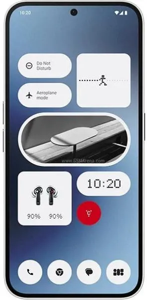
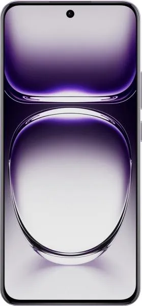
| Interface Design | Clean, minimalist aesthetic with the Glyph interface. | Potentially more vibrant and feature-rich ColorOS. | The Nothing Phone prioritizes visual clarity, potentially appealing to users who prefer a less cluttered experience. Oppo offers more customization options, potentially attracting users who value personalization. |
| Interaction Flow | Glyph interface offers unique notification and interaction options. | Traditional Android interaction with Oppo's customizations. | The Glyph interface introduces a novel way to interact with the phone, potentially enhancing engagement. Oppo's approach relies on familiarity, providing a comfortable experience for existing Android users. |
| Accessibility Features | Standard Android accessibility features. | Standard Android accessibility features. | Both phones likely offer similar accessibility features, but a deeper dive into specific implementations is needed for a comprehensive evaluation. |
| Design Ergonomics | Slightly heavier (190g) and thicker (8.6mm). | Lighter (180g) and slimmer (7.4mm). | The Oppo Reno12 Pro offers a slightly more comfortable in-hand feel due to its lighter weight and slimmer profile, especially for extended use. |
2. Narrative-Driven Feature Exploration:
Scenario: Imagine you're at a concert, the music is booming, and your phone vibrates. With the Nothing Phone (2a), the unique Glyph interface lights up in distinct patterns, allowing you to visually identify the notification without pulling out your phone. This subtle yet effective communication, driven by design, minimizes disruption in a noisy environment. Conversely, the Oppo Reno12 Pro relies on traditional vibrations and notifications, potentially requiring you to check your screen amidst the concert's excitement.
3. Inclusive Technology Evaluation:
Both phones cater to a broad audience with their Android operating system and mid-range pricing. However, the Nothing Phone (2a)'s Glyph interface might particularly appeal to users who prefer visual communication cues, potentially benefiting individuals with hearing impairments or those in noisy environments. The Oppo Reno12 Pro's emphasis on customization might attract users who enjoy tailoring their phone experience to their specific needs and preferences.
4. Design-Centric Decision Framework:
Choosing between these devices hinges on your personal interaction preferences. If you value minimalist aesthetics, innovative interaction methods, and subtle notification cues, the Nothing Phone (2a) could be your ideal companion. If you prioritize a slimmer profile, extensive customization options, and a more familiar Android experience, the Oppo Reno12 Pro emerges as the frontrunner. Ultimately, the "best" phone is the one that best aligns with your individual needs and design sensibilities.
Conclusion: Beyond the numbers, these phones represent two distinct design philosophies. The Nothing Phone (2a) embraces a bold, minimalist approach with its Glyph interface, while the Oppo Reno12 Pro offers a more conventional yet highly customizable Android experience. The choice is yours – embrace the innovative flair of Nothing or the refined familiarity of Oppo.

