Nokia G11 vs. Nothing Phone (2): A User-Centered Perspective
Let's embark on a journey beyond the raw specifications and delve into the heart of what makes these two phones tick – the user experience. Instead of a dry recitation of numbers, we'll explore how design choices translate into real-world interactions.
1. Design and Usability Assessment:
| Feature | Nokia G11 | Nothing Phone (2) | User Experience Impact |
|---|---|---|---|
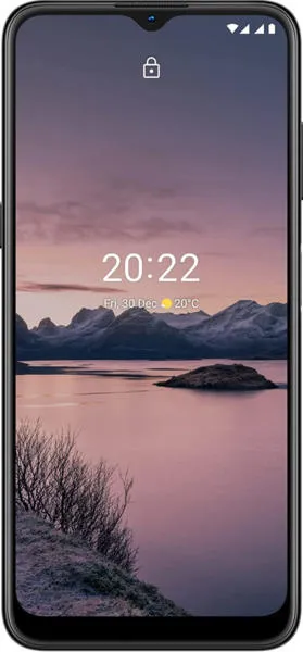
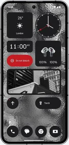
| Interface Design | Stock Android 11, Clean & Simple | Android 13 with Nothing OS, Glyph Interface | Nothing Phone (2) offers a unique visual experience with its Glyph system. |
| Interaction Flow | Basic, Functional | Fluid, potentially more feature-rich due to newer OS | Nothing Phone (2) likely provides a smoother, more responsive experience. |
| Accessibility Features | Standard Android Accessibility Options | Likely enhanced accessibility features with Android 13 | Nothing Phone (2) may offer more comprehensive accessibility options. |
| Design Ergonomics | Plastic Body, Durable Build | Glass and Aluminum, Premium Feel | Nothing Phone (2) provides a more premium and potentially less durable feel. |
2. Narrative-Driven Feature Exploration:
Scenario: A Day in the Life:
Imagine two users: Maria, a pragmatic individual who values simplicity and reliability, and Alex, a tech enthusiast who thrives on innovation and unique experiences.
Maria, with her Nokia G11, appreciates the clean, uncluttered interface. The phone reliably handles her daily calls, messaging, and basic web browsing. Its long battery life ensures she stays connected throughout the day without worry. The durable build withstands the bumps and drops of everyday life.
Alex, on the other hand, is captivated by the Nothing Phone (2)'s Glyph interface. The customizable light patterns add a playful element to notifications and interactions. The superior display immerses Alex in vibrant visuals while gaming or streaming. The powerful processor effortlessly handles demanding tasks, allowing for seamless multitasking.
3. Inclusive Technology Evaluation:
For a senior user unfamiliar with complex interfaces, the Nokia G11's simplicity would be a significant advantage. Its straightforward design minimizes confusion and promotes ease of use. The larger display icons and clear font enhance readability.
However, a visually impaired user might benefit from the advanced accessibility features offered by Android 13 on the Nothing Phone (2), such as enhanced screen readers and customization options.
4. Design-Centric Decision Framework:
The choice between these two devices hinges on individual priorities. If you value simplicity, reliability, and affordability, the Nokia G11 is a solid choice. If you crave innovation, unique features, and a premium experience, the Nothing Phone (2) beckons.
My Choice:
As Sophia Rodriguez, I would choose the Nothing Phone (2). While I appreciate the Nokia G11's user-friendly simplicity, I'm drawn to the Nothing Phone (2)'s innovative design philosophy. The Glyph interface, while potentially gimmicky to some, represents a bold step towards reimagining how we interact with our devices. Its superior display, powerful processor, and the promise of a more feature-rich operating system align with my appreciation for technology that pushes boundaries while remaining grounded in user experience. The premium materials and build quality also appeal to my aesthetic sensibilities. While recognizing the higher price point, the Nothing Phone (2) offers a more compelling and engaging overall user experience that resonates with my analytical framework. It's a device that sparks curiosity and invites exploration, and that's precisely the type of technology I find most exciting.
