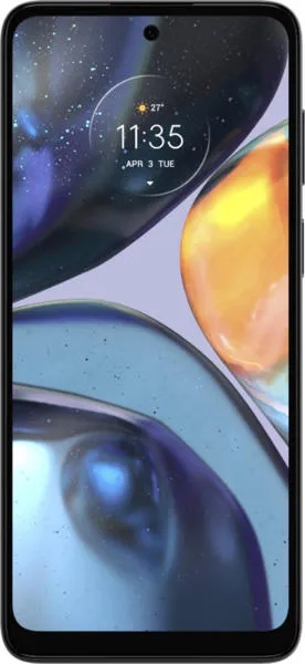
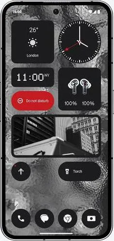
Motorola Moto G22 vs. Nothing Phone (2): A Tale of Two Experiences
As a technology communications specialist, my goal isn't just to compare specs, but to translate them into meaningful experiences. Let's delve into the Motorola Moto G22 and Nothing Phone (2), not as mere devices, but as gateways to distinct user interactions.
1. Design and Usability Assessment
| Feature | Motorola Moto G22 | Nothing Phone (2) | User Experience Impact |
|---|---|---|---|
| Interface Design | Standard Android Skin | Custom Glyph Interface | Nothing Phone's unique interface offers a distinctive visual and interactive experience. |
| Interaction Flow | Basic, Functional | Potentially more complex, feature-rich | Depending on user preference, the Glyph interface could be engaging or overwhelming. |
| Accessibility Features | Standard Android Accessibility Options | Potentially enhanced by Glyph system | The Glyph interface could offer innovative accessibility features if designed inclusively. |
| Design Ergonomics | Lighter (185g), potentially more comfortable | Heavier (201.2g), larger | Moto G22 might be preferable for extended use due to its lighter weight. |
2. Narrative-Driven Feature Exploration
Scenario: Imagine you're at a concert, trying to capture a video. The Moto G22 allows for basic 1080p recording, while the Nothing Phone (2) boasts 4K video with advanced stabilization. The Nothing Phone (2)'s superior video capabilities transform a shaky memory into a crisp, shareable moment. Its unique Glyph interface could even provide visual notifications during recording without disrupting the screen.
Scenario: You're navigating a bustling city using your phone for directions. The Nothing Phone (2)'s brighter, higher-resolution OLED display provides crystal-clear visibility even under direct sunlight, enhancing navigation and reducing eye strain compared to the Moto G22's IPS LCD. Its powerful Snapdragon processor ensures smooth map rendering and quick response times.
3. Inclusive Technology Evaluation
User 1: A Senior Citizen: The Moto G22's lighter weight and simpler interface might be less daunting. However, the Nothing Phone (2)'s brighter display and potentially customizable Glyph notifications could be beneficial for visual or auditory impairments if designed with accessibility in mind.
User 2: A Young Creative: The Nothing Phone (2)'s superior camera features, processing power, and distinctive design would likely appeal to a content creator. The Glyph interface could offer unique ways to interact with creative apps.
4. Design-Centric Decision Framework
Beyond the Specs: While the Nothing Phone (2) boasts superior hardware, the "best" choice hinges on individual priorities. Do you value a unique, potentially more complex user experience, or a simpler, more familiar one? Are cutting-edge camera features and processing power essential, or is a lighter, more budget-friendly device sufficient?
Design-Driven Insights: The Nothing Phone (2) embodies a bold design philosophy, pushing boundaries with its Glyph interface. The Moto G22 represents a more conventional approach, prioritizing functionality and affordability.
My Choice: The Nothing Phone (2)
While the Moto G22 offers a solid foundation, the Nothing Phone (2) resonates with my appreciation for innovative design and user-centric technology. Its unique Glyph interface, while potentially polarizing, demonstrates a commitment to reimagining user interaction. The superior display, camera, and performance capabilities elevate the overall user experience. While the heavier weight is a consideration, the potential for the Glyph system to be leveraged for accessibility features, coupled with the phone's powerful hardware, makes the Nothing Phone (2) a compelling choice for users seeking a distinct and future-forward mobile experience. It embodies the exciting possibilities of design-led technology, promising a journey beyond the conventional.

