Motorola Edge 40 Neo vs. Nothing Phone (2a) Plus: A User-Centered Perspective
Let's dive into a comparative analysis of the Motorola Edge 40 Neo and the Nothing Phone (2a) Plus, focusing on the human experience rather than just specs.
1. Design and Usability Assessment:
| Feature | Motorola Edge 40 Neo | Nothing Phone (2a) Plus | User Experience Impact |
|---|---|---|---|
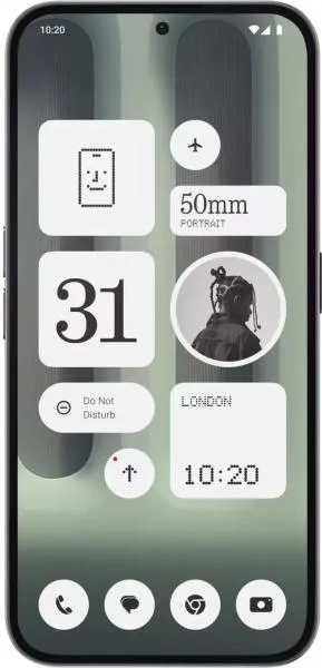
| Interface Design | Clean, stock Android experience | Glyph interface, custom Android skin | The Glyph interface is unique, offering visual notifications and charging indicators. Stock Android on the Edge 40 Neo may appeal to users preferring simplicity. |
| Interaction Flow | Smooth, 144Hz refresh rate | Smooth, 120Hz refresh rate | Both offer fluid navigation, though the Edge 40 Neo's higher refresh rate might provide a slightly more responsive feel. |
| Accessibility Features | Standard Android accessibility options | Standard Android accessibility options | Both rely on Android's built-in accessibility features. |
| Design Ergonomics | Lighter (170g), thinner (7.9mm) | Heavier (190g), thicker (8.5mm) | The Edge 40 Neo offers a more lightweight and compact design, potentially improving one-handed usability and comfort. |
2. Narrative-Driven Feature Exploration:
Scenario: Imagine a busy professional constantly on the move. The Edge 40 Neo's lighter weight and slim profile slip effortlessly into a pocket, making it ideal for navigating crowded commutes. Its vibrant 144Hz display ensures smooth scrolling through emails and presentations. Conversely, the Nothing Phone (2a) Plus, with its distinctive Glyph interface, allows for silent, customized notifications, ensuring important messages aren't missed during meetings without disturbing others.
3. Inclusive Technology Evaluation:
User 1: A Senior Citizen: The Edge 40 Neo's lighter weight might be preferable for users with reduced hand strength. The clean Android interface could be easier to navigate than a customized skin.
User 2: A Young Creative: The Nothing Phone (2a) Plus's unique Glyph interface and customizable features might appeal to a user seeking a more expressive and personalized device.
4. Design-Centric Decision Framework:
The choice boils down to individual priorities. If lightweight portability and a clean Android experience are paramount, the Edge 40 Neo is a strong contender. If a unique design, customizable notifications, and a slightly larger screen are preferred, the Nothing Phone (2a) Plus stands out.
My Choice:
As Sophia Rodriguez, I would choose the Motorola Edge 40 Neo. While the Nothing Phone (2a) Plus offers a unique visual identity with its Glyph interface, my analysis prioritizes user experience fundamentals. The Edge 40 Neo's superior ergonomics, coupled with the smooth 144Hz display and clean Android experience, create a more universally appealing and comfortable user experience. The lighter weight significantly impacts daily usability, especially for extended use. While innovation is important, core functionality and comfort remain paramount for a truly user-centered design. The Edge 40 Neo delivers on these core principles, making it the more compelling choice in my evaluation.
