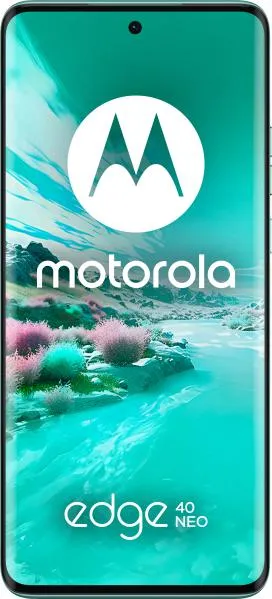
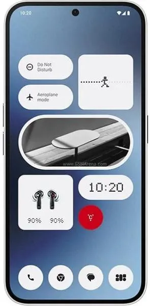
Motorola Edge 40 Neo vs. Nothing Phone (2a): A User-Centered Comparison
Let's dive into a comparative analysis of the Motorola Edge 40 Neo and the Nothing Phone (2a), focusing on the user experience rather than just raw specifications.
1. Design and Usability Assessment
| Feature | Motorola Edge 40 Neo | Nothing Phone (2a) | User Experience Impact |
|---|---|---|---|
| Interface Design | Clean, stock Android experience | Glyph Interface, custom Android skin | Nothing's unique Glyph interface offers visual notifications and charging indicators, adding personality. |
| Interaction Flow | Smooth, thanks to the 144Hz refresh rate | Smooth, but potentially less so with the 120Hz refresh rate | The Edge 40 Neo's higher refresh rate might offer a slightly smoother visual experience. |
| Accessibility | Standard Android accessibility features | Standard Android accessibility features, Glyph customizations | Glyph customizations could potentially enhance visual accessibility for notifications. |
| Ergonomics | Lighter (170g) and thinner (7.9mm) | Heavier (190g) and thicker (8.6mm) | The Edge 40 Neo offers a more comfortable one-handed experience due to its lighter and slimmer profile. |
2. Narrative-Driven Feature Exploration
Scenario: Imagine you're at a crowded concert.
- Edge 40 Neo: You effortlessly navigate through your phone, capturing smooth slow-motion videos of the performance thanks to its 240fps recording capability at 1080p. The bright 1300 nit display ensures visibility even under bright stage lights.
- Phone (2a): The Glyph interface pulsates with the rhythm of the music, providing a unique visual notification experience without having to look at the screen. You capture the energy of the crowd with stable 4K video, leveraging the powerful Dimensity 7200 Pro chipset.
3. Inclusive Technology Evaluation
Both phones offer standard Android accessibility features. However, the Phone (2a)'s Glyph interface could be particularly beneficial for users with visual impairments, providing a distinctive way to identify notifications without relying solely on audio cues. The Edge 40 Neo's lighter weight makes it more accessible for users with limited hand strength or mobility.
4. Design-Centric Decision Framework
For the user who prioritizes:
- Smoothness and lightweight design: The Edge 40 Neo's 144Hz display and slim profile make it a winner.
- Unique visual identity and a powerful processor: The Nothing Phone (2a)'s Glyph interface and Dimensity 7200 Pro chipset offer a distinct experience.
My Choice: The Motorola Edge 40 Neo
While the Nothing Phone (2a) offers a unique aesthetic with its Glyph interface, I would choose the Motorola Edge 40 Neo. My decision hinges on the superior combination of user experience factors. The smoother 144Hz display, noticeable in everyday use, coupled with the significantly lighter and thinner design, prioritizes comfort and ease of use. For me, these practical advantages outweigh the novelty of the Glyph interface. The Edge 40 Neo delivers a more comfortable in-hand experience, crucial for extended use, and its sleek design aligns with my preference for understated elegance. While both phones offer comparable performance, the subtle yet significant enhancements in day-to-day usability make the Edge 40 Neo the clear winner for my personal needs and preferences. The faster refresh rate enhances visual clarity and responsiveness, contributing to a more fluid and enjoyable user experience, particularly when browsing, gaming, or scrolling through social media. This, combined with the ergonomic design, ultimately defines a more user-friendly device for my everyday interactions.

