iPhone SE (2022) vs. Nothing Phone (2): A User-Centered Perspective
Let's move beyond the numbers and delve into the heart of what makes these phones unique experiences. We'll explore their design philosophies, user interface nuances, and how they cater to diverse needs.
1. Design and Usability Assessment:
| Feature | iPhone SE (2022) | Nothing Phone (2) | User Experience Impact |
|---|---|---|---|
| Interface Design | Classic iOS, familiar, minimalist | Android 13 with Nothing OS | iOS offers a consistent, predictable experience; Nothing OS provides customization options, potentially overwhelming for new users. |
| Interaction Flow | Single-hand friendly, simple navigation | Larger screen, gesture-based, more complex | SE caters to one-handed use and quick interactions; Phone (2) offers a more immersive experience but requires two hands. |
| Accessibility Features | Robust suite of accessibility options | Standard Android accessibility features | Apple prioritizes accessibility with deeper integration and customization. |
| Design Ergonomics | Compact, lightweight, durable build | Larger, heavier, glass back | SE emphasizes portability and durability; Phone (2) prioritizes a modern aesthetic, sacrificing some practicality. |
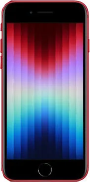
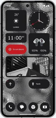
| Display | Small, bright Retina IPS LCD | Large, vibrant LTPO OLED, 120Hz refresh rate | SE's display is sharp but smaller; Phone (2)'s display offers a superior visual experience with smoother scrolling and richer colors. |
| Performance | Powerful A15 Bionic chip, smooth performance | Snapdragon 8+ Gen 1, excellent performance | Both offer excellent performance, but the Phone (2)'s newer chip might provide a slight edge in demanding tasks and sustained performance. |
| Unique Features | Tactile Home button with Touch ID | Glyph Interface, customizable LED lighting | SE offers a familiar, reliable biometric option; Phone (2) offers a unique visual element with its Glyph Interface, adding a playful, futuristic touch. |
2. Narrative-Driven Feature Exploration:
Scenario: Imagine a busy professional needing quick access to emails on the go. The SE's compact size and Touch ID allow for instant unlocking and one-handed navigation, enabling efficient email checking even while juggling other tasks. Conversely, the Phone (2), with its larger screen, excels at immersive content consumption. Picture relaxing on a commute and enjoying a vibrant video on the Phone (2)'s stunning OLED display with smooth 120Hz scrolling.
3. Inclusive Technology Evaluation:
User 1: A senior citizen might appreciate the SE's simplicity and tactile Home button. User 2: A young professional might prefer the Phone (2)'s modern design and advanced features. User 3: A visually impaired user would benefit from the comprehensive accessibility features offered by both platforms, but Apple's deeper integration might provide a more tailored experience.
4. Design-Centric Decision Framework:
The choice boils down to individual priorities. Do you value compact portability and simplicity, or a larger, more immersive experience with unique design elements?
My Choice: As Sophia Rodriguez, I would choose the Nothing Phone (2). While I admire the SE's classic design and user-friendly interface, the Phone (2)'s innovative Glyph Interface, stunning OLED display, and powerful performance align with my appreciation for cutting-edge technology and unique design expressions. The larger screen size and smoother refresh rate enhance content consumption and creative tasks, crucial for my work as a technology communicator. While I acknowledge the benefits of the SE's compact form factor, the Phone (2)'s overall user experience feels more aligned with my personal and professional needs. The Phone (2) represents a bold step towards a more expressive and personalized mobile experience, and I'm excited to explore its potential.
